The Ghost Note: Poster Design
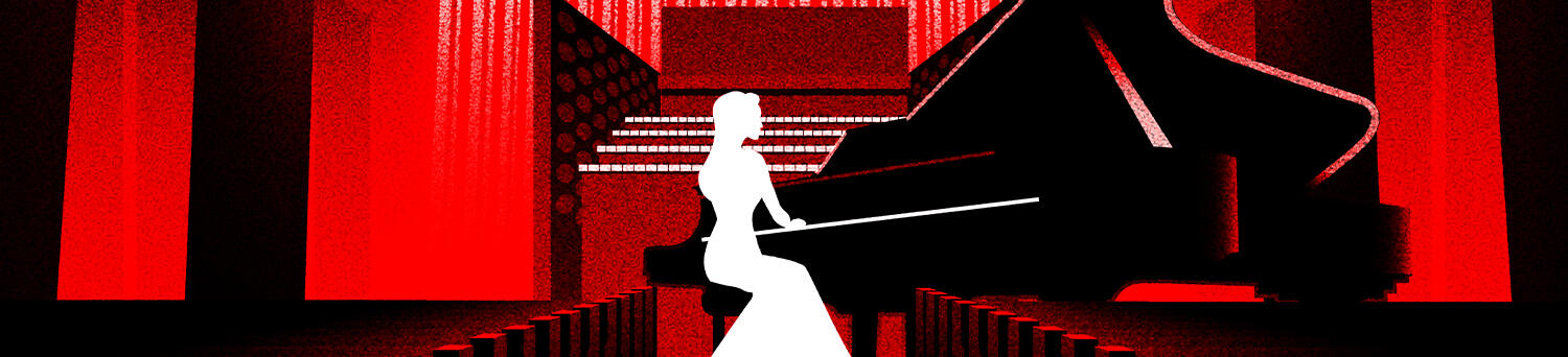
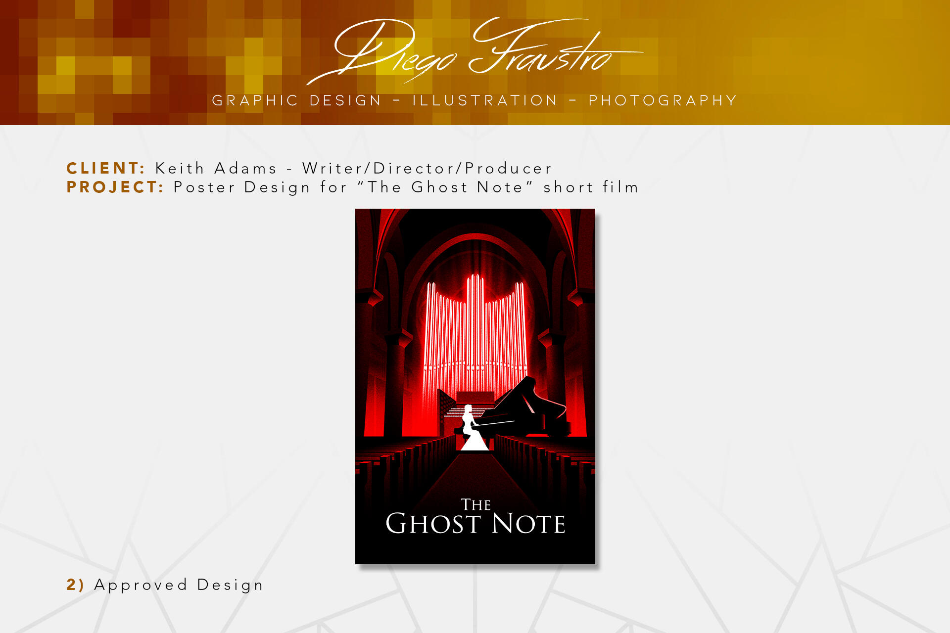
One summer day in 2023, while relaxing and watching videos online, I came across a YouTube channel featuring horror short films, each with millions of views. What immediately caught my attention was how professionally crafted these films were, they looked like they came straight out of Hollywood. Intrigued, I watched a few and discovered one that completely captivated me: a short film titled 'Chromophobia'. The director, intriguingly, was credited as Keith Adams.Being naturally curious, I decided to dig deeper, hoping to find more of Keith’s work. Instead, I stumbled upon his website, which had a contact section. On a whim, I decided to write him a message, congratulating him on 'Chromophobia'. As part of the process, I included my email address and linked my illustration portfolio.To my complete surprise, Keith responded. Not only was he impressed with my illustration work, but he also invited me to create the poster for his upcoming film, 'The Ghost Note'. I was absolutely mind-blown. Never in my wildest dreams did I imagine that I would make my debut in the film industry in such an incredible way.Since I don't want to spoil the plot of the short film, I’ll focus on the workflow process for this project. A year after I was hired (in the summer of 2024), Keith gave me the green light to begin working on the poster. He provided numerous references and a clear vision for what he wanted.The key elements to incorporate were the silhouette of the lead protagonist, a piano, a pipe organ, and a church. The atmosphere needed to convince the viewer that the church was haunted. Many of the references Keith shared were posters from existing films, which made it obvious that I had to take a Film Noir approach for the design.After a lot of work and experimentation, I ultimately created this:

Keith was captivated by the design and composition, but he requested a few minor adjustments. He wanted the organ pipes to have more intricate detail, the organ keyboards to be depicted more literally rather than implied, and asked for the removal of the simulated text where credits are typically placed. These changes led to the final design, which is as follows:
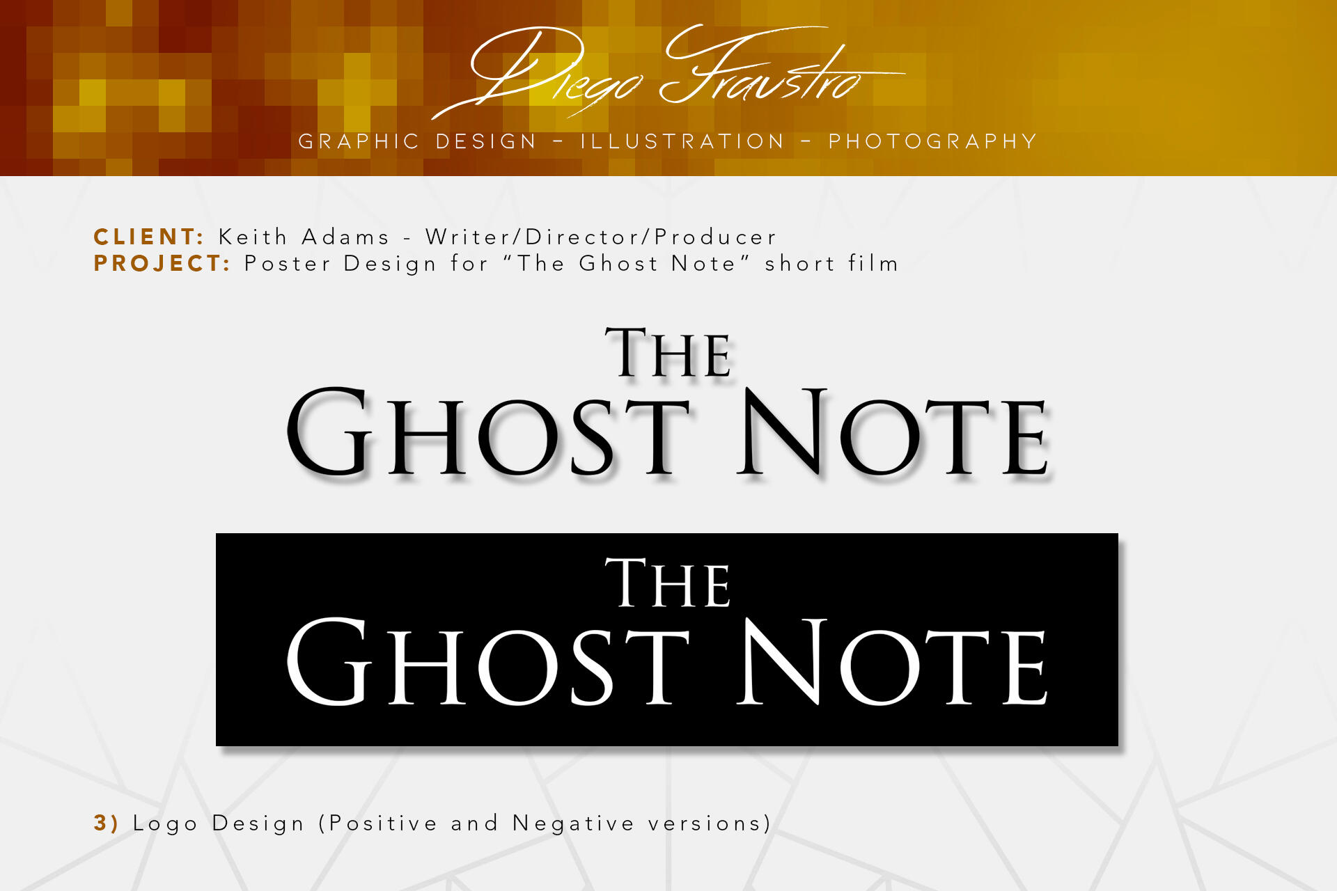
Since the first draft of the poster required so much time and effort, I decided to unwind by focusing on the logo design, which had already been chosen and approved before the poster was shown to Keith. Below are both the positive and negative versions of the logo:
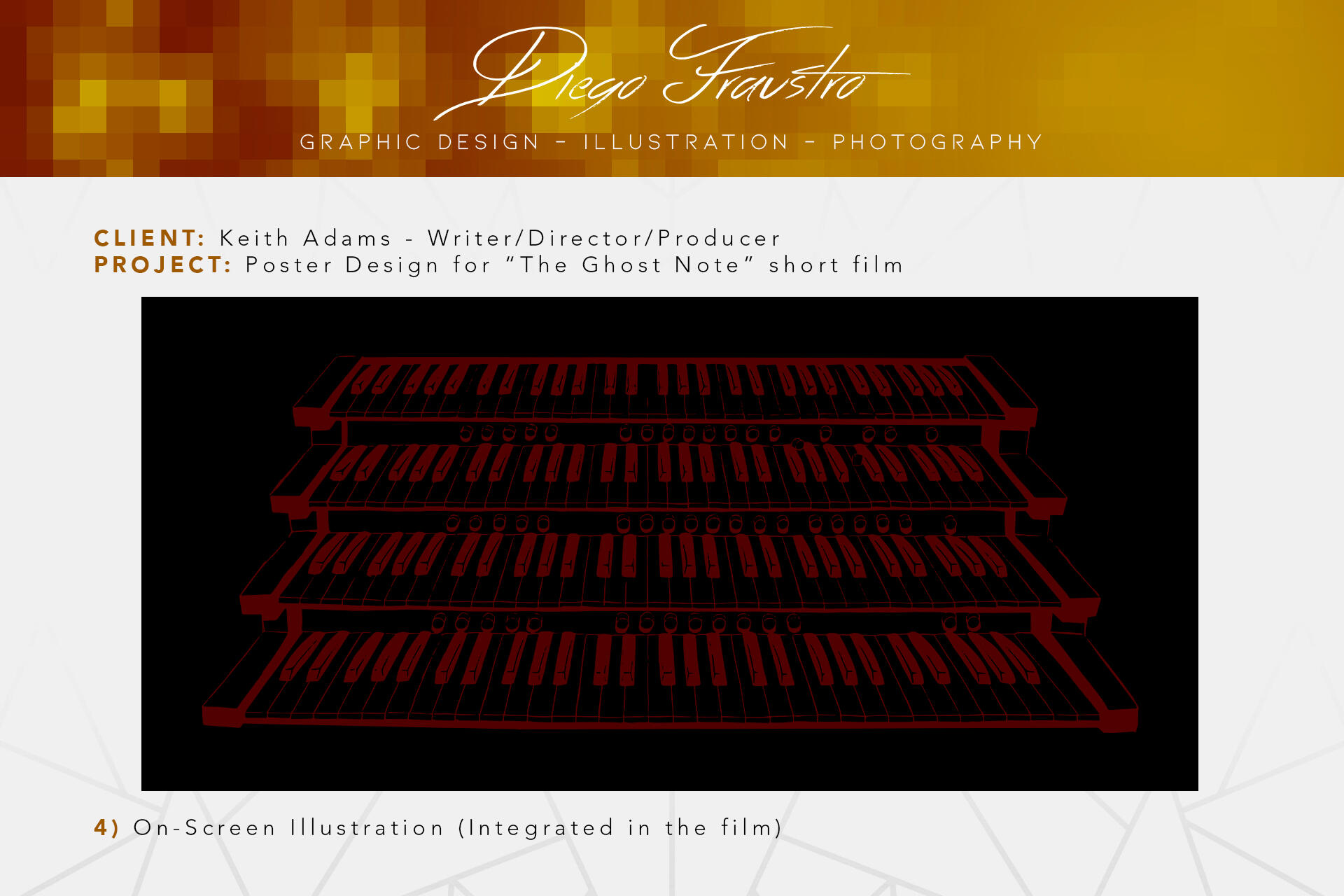
Finally, Keith requested a hand-drawn illustration of four rows of keys, representing the organ's keyboard. The drawing had to have an organic, hand-crafted feel. This artwork was then featured at the end of the film's trailer.
Seeing my work come to life in such a unique way was a very fulfilling experience. The poster and accompanying design elements helped set the tone for 'The Ghost Note', and I feel blessed to have given the opportunity to contribute to the film's narrative. This project didn't just mark my debut in the film industry, but also help me push my boundaries and refine my workflow. The result was a visual piece that encapsulated the haunting atmosphere of the film, and in the future, I will look back at it with immense pride.